The Basic Principles of Graphic Design (And How They Work in the Real World)
Graphic design is not about making things look good; it’s about making them easier to understand. Yes, that’s true. A good design is one that you can understand just by looking at it. A great design grabs attention, effectively communicates a message, and keeps the viewer engaged. But how can you make that happen? It all comes down to a few fundamental design principles that guide everything from website layouts to product packaging. Let’s break them down and see how they apply to real-world projects!
3/28/20256 min read


1. Balance – Keeping Things Visually Stable
Have you ever looked at a design and felt like something was “off,” like it was incomplete? This usually happens when the balance isn’t right. Balance is about arranging elements so that no part of the design feels too heavy or too empty.
How It Works in Real Life:
Symmetrical balance (formal) – Think of a business card where the logo is centered, and the text is evenly aligned. It feels structured and professional.
Asymmetrical balance (informal) – Think of a magazine spread where a large image is balanced by bold text on the other side. It feels modern and dynamic.
Example: Imagine you’re designing a restaurant menu. If all the text is on one side and all the images on the other, it will look lopsided. But if you mix text and images evenly, it feels well-balanced and easy to navigate.
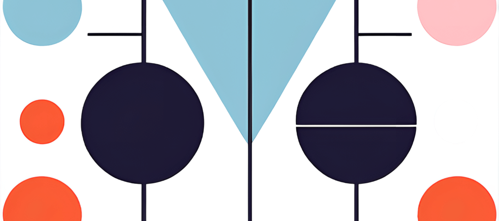
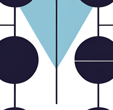
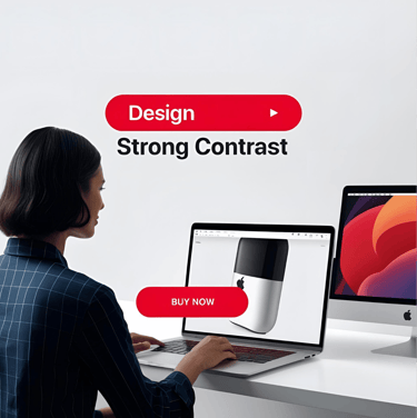
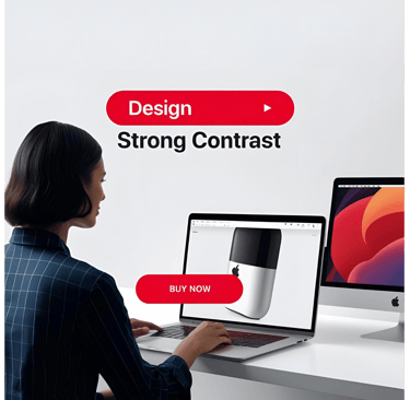
2. Contrast – Making Important Things Stand Out
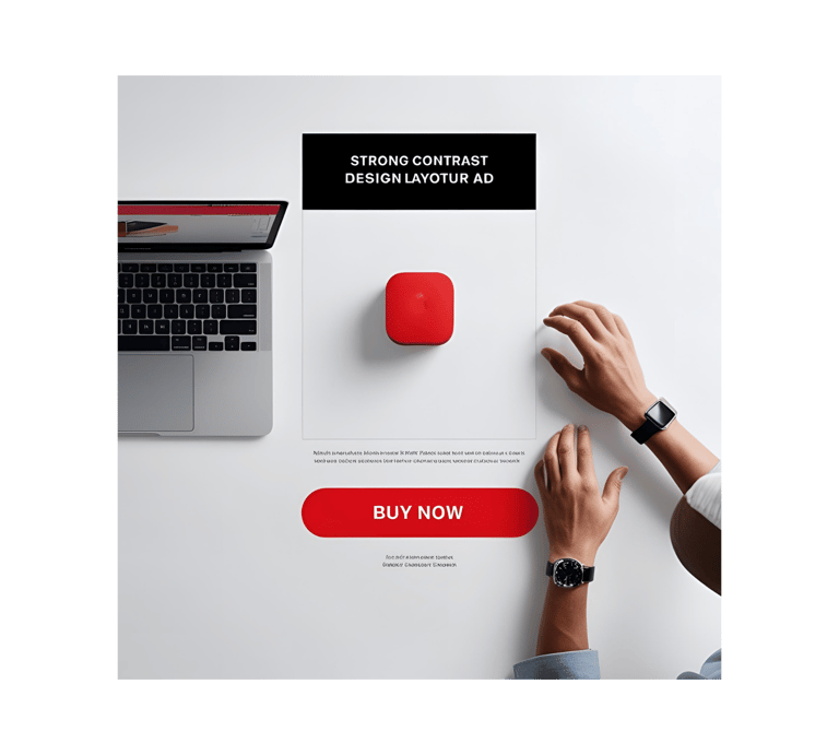
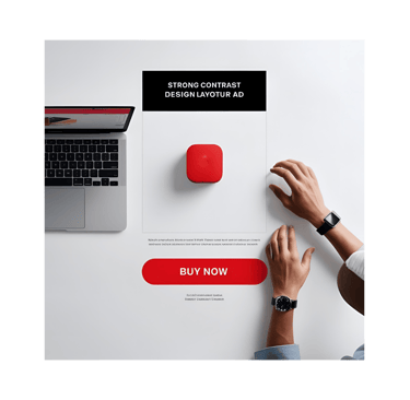
If everything in a design looks the same, nothing stands out. For example, take a food poster. If the offer on it is written in small text and without high-contrast colors, then the poster will not be seen for the purpose it was created. That's why contrast helps direct attention by using differences in color, size, shape, or font.
How It Works in Real Life:
A "Buy Now" button on a website should be bright and bold, so it’s easy to spot. A red button on a white background? Perfect. A gray button on a slightly darker gray background? Not so much.
Movie posters use contrast by making the main character or title pop with bold colors against a dark background.
Example: Think of Apple’s website. Their text is clean and minimal, but the product images stand out with sharp contrast. Your eye immediately goes to the product they want you to focus on.
3. Alignment – Keeping Things Organized
Alignment ensures that everything in your design looks intentional—not like you just dropped text and images randomly on a page.
How It Works in Real Life:
Websites use grid layouts to keep text and images lined up, making them easier to navigate.
Resumes with neat left-aligned text look professional, while a scattered layout feels messy.
Example: Imagine you’re making an Instagram post for your brand. If your text is slightly off-center or misaligned, it will look unpolished. But if everything is neatly lined up, it feels professional and clean.
4. Repetition – Creating a Cohesive Look
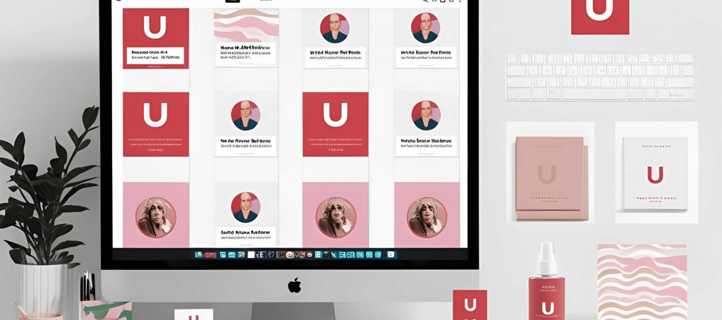
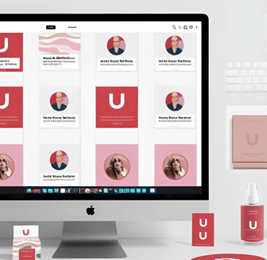
Repetition helps make a design look more professional. You can take examples from big companies—like their brand colors and fonts—which are usually consistent to make them more recognizable to people. Repetition is the secret to making designs look consistent and polished. It’s about using the same fonts, colors, and elements throughout a project.
How It Works in Real Life:
A brand’s social media graphics should use the same colors and fonts to create a recognizable identity.
Websites repeat button styles so users always know where to click.
Example: Ever noticed how Coca-Cola always uses red and white in its branding? That’s repetition at work! It helps build brand recognition and trust.
5. Proximity – Grouping Related Elements Together
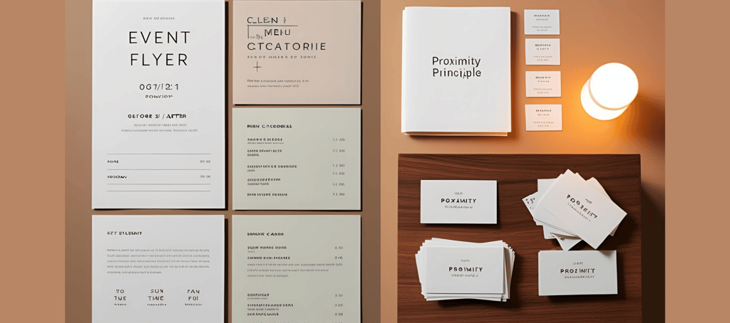
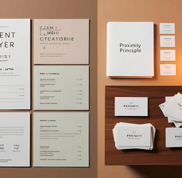
Have you ever looked at a messy flyer and wondered where to look first? Yes, this happens when the Proximity Principle is ignored in design. Proximity is about keeping related things close together so they’re easier to understand at a glance.
How It Works in Real Life:
On a business card, the name, phone number, and email should be grouped together, not scattered randomly.
In a restaurant menu, dishes should be grouped by category (appetizers, mains, desserts) instead of mixed up randomly.
Example: Imagine you’re designing a flyer for an event. If the date, time, and location are all far apart, it’ll be confusing. But if they’re grouped together, people can quickly find what they need.
6. White Space – Letting Designs Breathe
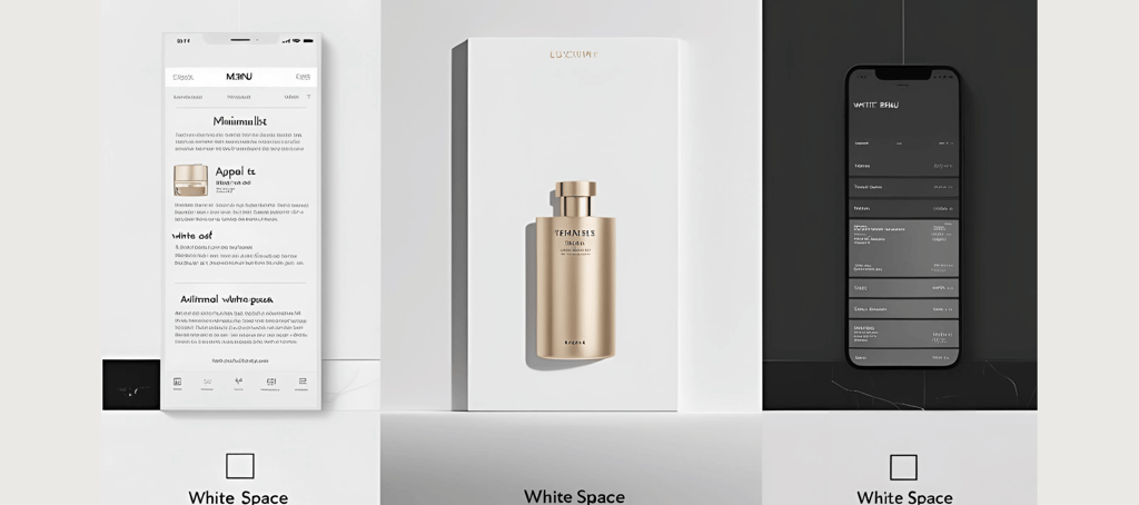
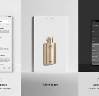
Ever seen a cluttered design that feels overwhelming? Like a flyer packed with text, images, and colors fighting for attention? Yes, this happens when White Space is ignored in design. White space (also called negative space) is the empty space around elements. It makes a design feel clean, elegant, and easy to read.
How It Works in Real Life:
Luxury brands like Apple and Chanel use lots of white space in their ads to create a sleek, high-end feel.
Minimalist websites remove clutter and focus on key messages.
Example: Imagine a crowded restaurant menu with tons of text crammed together—overwhelming, right? Now picture a menu with clear sections and space between items. Much easier to read!
7. Hierarchy – Directing Attention to What’s Most Important
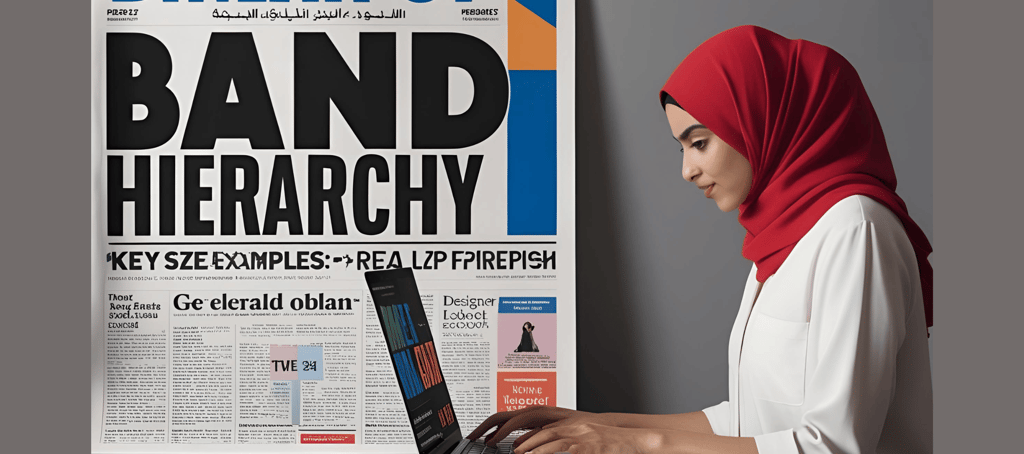
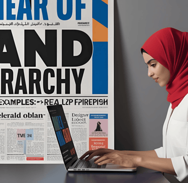
Have you ever seen a messy flyer where you just can’t figure out what to look at first? That’s what happens when the Hierarchy Principle is ignored! Hierarchy tells viewers where to look first by making key elements bigger, bolder, or placed in prime spots.
How It Works in Real Life:
Headlines in articles are bigger than body text so you know where to start reading.
Sale signs in stores use huge red text to grab your attention instantly.
Example: If you’re designing a concert poster, the band’s name should be huge, the date and venue should be slightly smaller, and extra details should be even smaller. This ensures people see the most important information first.
Applying These Principles in Real-World Projects
Now, let’s see how these principles come together in actual design work:
Website Design
A good website follows alignment (grid layout), contrast (bold CTA buttons), and hierarchy (larger headings and images). For example, an e-commerce website ensures that product images are big and prices are clearly visible. You can also take an example from this website by visiting the shop page.
Poster Design
A great food poster uses contrast (vibrant food images against a clean background), repetition (consistent fonts and colors), and white space (to keep the design fresh and appetizing). For example, a restaurant special or food festival poster will highlight the main dish or offer with bold fonts and mouth-watering visuals, while additional details like ingredients or pricing will be in smaller text for easy reading. Check out this website’s shop page, where I’ve created 15+ food posters!
Logo Design
A strong logo maintains balance, repetition, and simplicity. For example, Nike’s swoosh is minimal but powerful, with a balanced composition that works on everything from shoes to billboards.
Final Thoughts
Great design isn’t just about throwing elements together—it’s about knowing how to use space, contrast, and alignment to guide the viewer’s eye. Whether you’re designing a website, an Instagram post, or a logo, these principles will help you create something that’s not just beautiful but also functional.
So next time you work on a design, ask yourself:
Q 1) Is it balanced?
Q 2) Does it have enough contrast?
Q 3) Is it easy to read?
If the answer is yes, you’re on the right track! Now go out there and create something amazing.
Unlock creativity with customizable Canva templates today.
contact us
support@templatego.in
© 2025. All rights reserved.